Overview
Overview
Overview
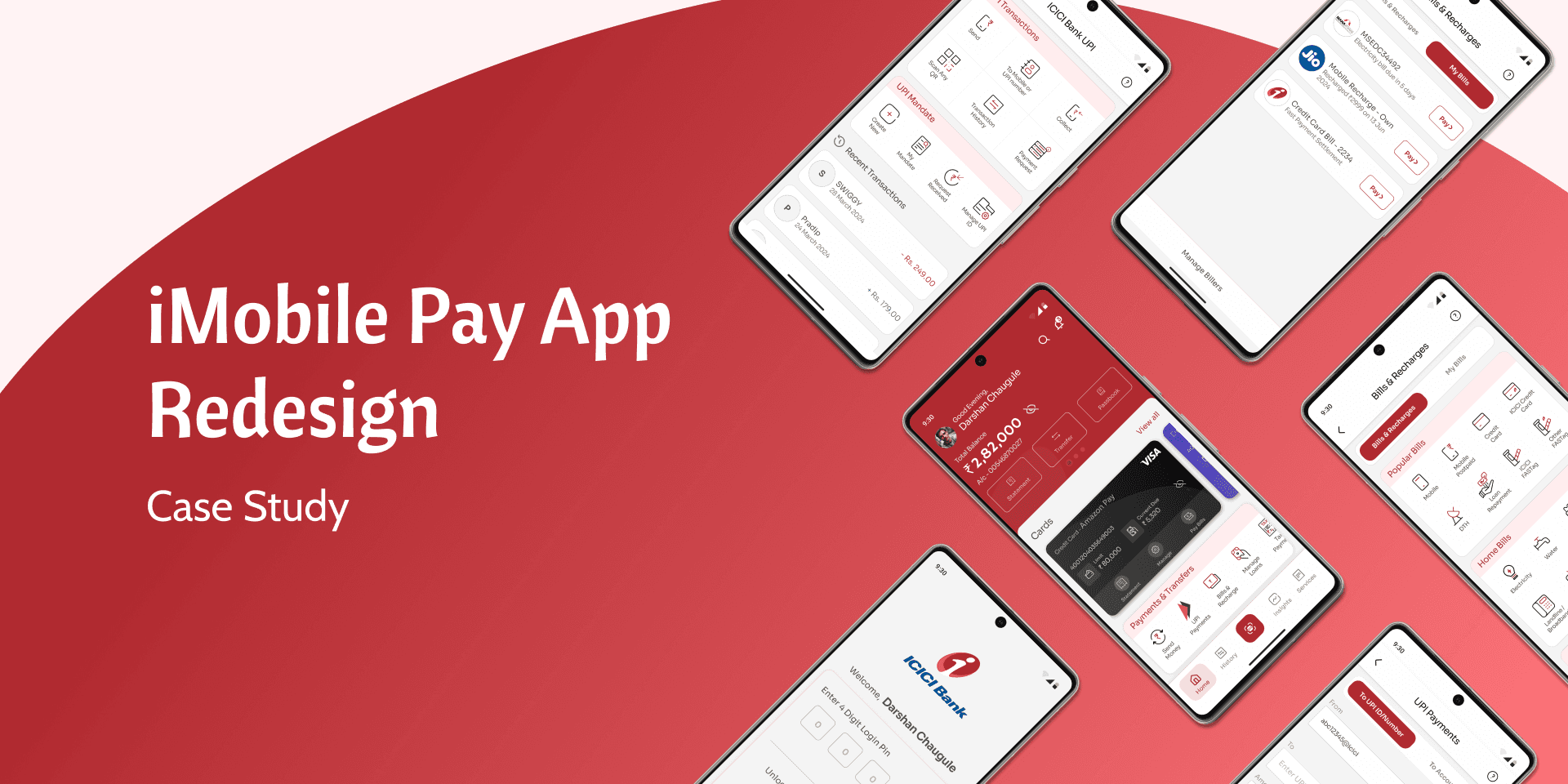
ICICI Bank Limited, a leading Indian multinational, operates a vast network of branches and ATMs across India and internationally. Its iMobile Pay app provides over 400 banking services, catering to both ICICI and non-ICICI customers. The app facilitates loan applications, savings account management, fund transfers, UPI payments, and more. Despite its extensive features, the app faces issues with complexity and clutter, highlighting the need for a more streamlined and user-friendly design.
ICICI Bank Limited, a leading Indian multinational, operates a vast network of branches and ATMs across India and internationally. Its iMobile Pay app provides over 400 banking services, catering to both ICICI and non-ICICI customers. The app facilitates loan applications, savings account management, fund transfers, UPI payments, and more. Despite its extensive features, the app faces issues with complexity and clutter, highlighting the need for a more streamlined and user-friendly design.
Duration
Duration
Duration
3 Weeks
3 Weeks
3 Weeks
Role
Role
Role
UX Designer
UX Designer
UX Designer
Tools
Tools
Tools
Miro, Figma
Miro, Figma
Miro, Figma
Disclaimer
Disclaimer
Disclaimer
This is a self-published project and is not professionally associated with ICICI Bank. The views expressed in this case study are my own. I am not suggesting that ICICI Bank adopt my redesign. This is an attempt to enhance my design skills by analyzing a popular app.
This is a self-published project and is not professionally associated with ICICI Bank. The views expressed in this case study are my own. I am not suggesting that ICICI Bank adopt my redesign. This is an attempt to enhance my design skills by analyzing a popular app.
What made me choose icici bank app for a redesign?
What made me choose icici bank app for a redesign?
What made me choose icici bank app for a redesign?
The inspiration to redesign the ICICI Bank mobile app came from my personal experience, which felt cumbersome. That’s when the idea struck me: ICICI Bank's app could benefit from a revamp to enhance the entire user experience. This project also serves as an opportunity for me to hone my design skills and put them to use.
The inspiration to redesign the ICICI Bank mobile app came from my personal experience, which felt cumbersome. That’s when the idea struck me: ICICI Bank's app could benefit from a revamp to enhance the entire user experience. This project also serves as an opportunity for me to hone my design skills and put them to use.
The Challenge
The Challenge
The Challenge
My goal was to revamp the ICICI Bank iMobile app to push the limits of my design skills and create a more visually appealing and seamless user experience. The challenge involved a comprehensive redesign process: identifying problems, creating wireframes, and producing high-fidelity mock-ups and prototypes. I began with thorough research to understand existing user experiences, then mapped out pain points and opportunities for improvement. With a clear roadmap in hand, I set out to transform the app and enhance its overall functionality.
My goal was to revamp the ICICI Bank iMobile app to push the limits of my design skills and create a more visually appealing and seamless user experience. The challenge involved a comprehensive redesign process: identifying problems, creating wireframes, and producing high-fidelity mock-ups and prototypes. I began with thorough research to understand existing user experiences, then mapped out pain points and opportunities for improvement. With a clear roadmap in hand, I set out to transform the app and enhance its overall functionality.
Understanding The User
Understanding The User
Understanding The User
To start my research, I looked for iMobile users among friends and colleagues but found they were using other banking apps. So, I analyzed recent app reviews from app stores to identify issues and gather insights. I also reviewed feedback for other banking apps to see what works and what doesn’t and I analyzed the iMobile app to uncover the key issues affecting the current user experience. Below are screenshots of some negative reviews highlighting common user frustrations.
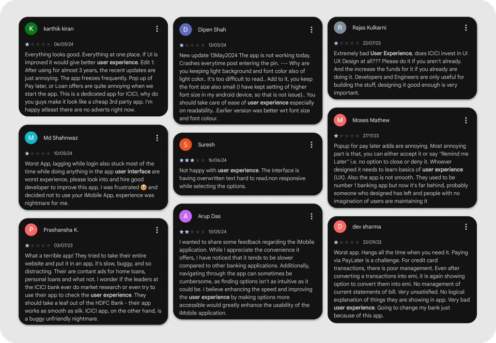

These were the key user experience pain points that stood out:
1. Frequent App Crashes and Freezes.
Intrusive Advertisements and Pop-ups.
Poor User Interface and Experience.
Slow Performance and Lag.
I chose to focus on the poor user interface & experience because it had the biggest impact on usability. Improving this would make the app more intuitive and user-friendly, helping to address other issues too.
Persona
Persona
Persona

On to the Redesign
On to the Redesign
On to the Redesign
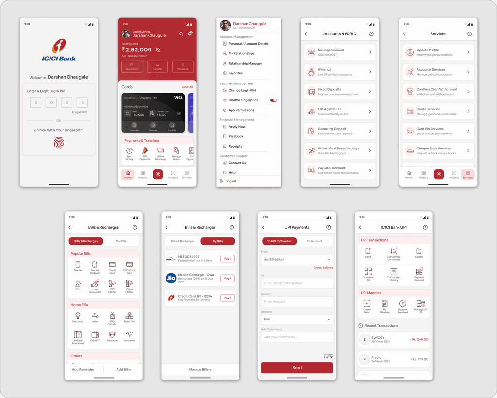
Selected Screens For Redesign - Based on the insights gained from my research, I selected a few key screens from the app to redesign.
Merging Menus for a Smoother User Experience - I streamlined the app by consolidating two separate menus and removing duplicates, grouping features into clear, logical categories for a more intuitive experience.
Merging Menus for a Smoother User Experience - I streamlined the app by consolidating two separate menus and removing duplicates, grouping features into clear, logical categories for a more intuitive experience.
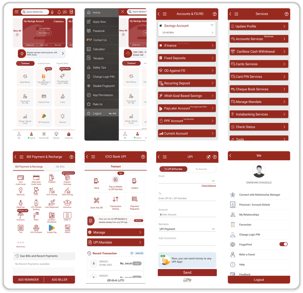

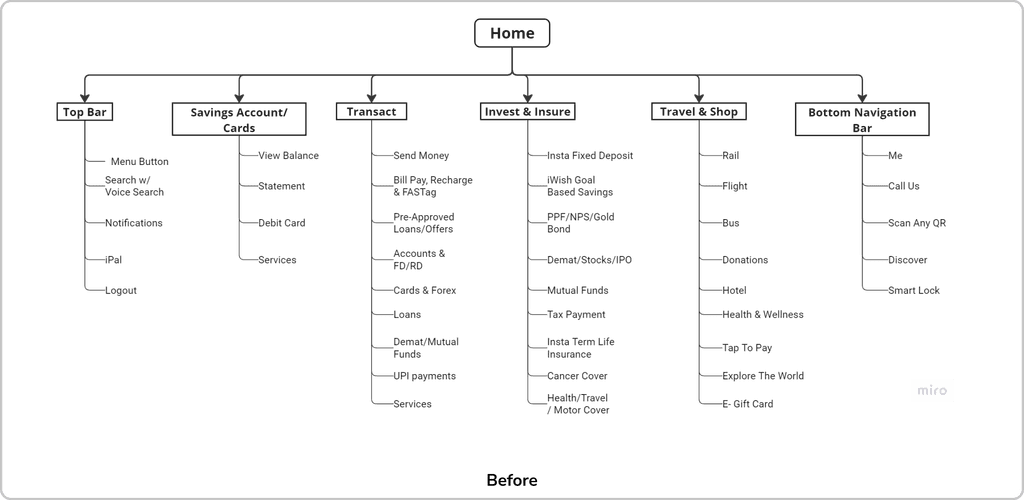
Current Information Architecture - After hearing users' frustrations with confusing navigation, an outdated interface, and sluggish performance, I took a deep dive into the app's current Information Architecture (IA). This helped me get a clear picture of the existing setup and laid the groundwork for my redesign.
Current Information Architecture - After hearing users' frustrations with confusing navigation, an outdated interface, and sluggish performance, I took a deep dive into the app's current Information Architecture (IA). This helped me get a clear picture of the existing setup and laid the groundwork for my redesign.

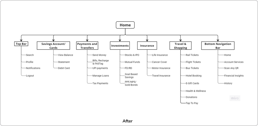
Revised IA - Then I revised the current IA to reduce clutter by separating features into their own logical groups and removing unimportant and duplicate features from the home screen. This restructuring aims to improve usability by ensuring a more intuitive user experience across the app
Revised IA - Then I revised the current IA to reduce clutter by separating features into their own logical groups and removing unimportant and duplicate features from the home screen. This restructuring aims to improve usability by ensuring a more intuitive user experience across the app
Revised IA - Then I revised the current IA to reduce clutter by separating features into their own logical groups and removing unimportant and duplicate features from the home screen. This restructuring aims to improve usability by ensuring a more intuitive user experience across the app

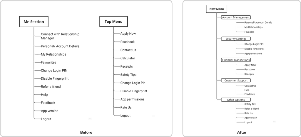
Merging Menus for a Smoother User Experience - I streamlined the app by consolidating two separate menus and removing duplicates, grouping features into clear, logical categories for a more intuitive experience.
Merging Menus for a Smoother User Experience - I streamlined the app by consolidating two separate menus and removing duplicates, grouping features into clear, logical categories for a more intuitive experience.
Merging Menus for a Smoother User Experience - I streamlined the app by consolidating two separate menus and removing duplicates, grouping features into clear, logical categories for a more intuitive experience.

Ideation and Wireframe
Ideation and Wireframe
Ideation and Wireframe
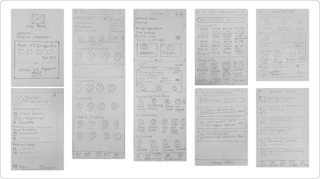
I analyzed competitors' apps and various design trends, initially considering the original layout but found it inflexible for future changes. I chose to redesign from scratch, creating modern, minimal wireframes that cater to a wide user range, from college students to the elderly.
I analyzed competitors' apps and various design trends, initially considering the original layout but found it inflexible for future changes. I chose to redesign from scratch, creating modern, minimal wireframes that cater to a wide user range, from college students to the elderly.
I analyzed competitors' apps and various design trends, initially considering the original layout but found it inflexible for future changes. I chose to redesign from scratch, creating modern, minimal wireframes that cater to a wide user range, from college students to the elderly.

Iconography
Iconography
Iconography
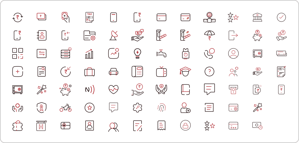
Before diving into screen design, I started from scratch with the icons. The old ones were outdated and inconsistent, so I gave them a modern, dual-tone makeover for a sleek, cohesive look. This took quite a bit of time!
Before diving into screen design, I started from scratch with the icons. The old ones were outdated and inconsistent, so I gave them a modern, dual-tone makeover for a sleek, cohesive look. This took quite a bit of time!

Refining The Design
Refining The Design
Refining The Design
Home Screen
Home Screen
I initially considered sticking with the original layout, but after a thorough analysis, I realized it wouldn’t accommodate future changes or new features effectively. Although adopting a completely new design from scratch would be challenging, I decided it was essential for long-term flexibility and growth.
I initially considered sticking with the original layout, but after a thorough analysis, I realized it wouldn’t accommodate future changes or new features effectively. Although adopting a completely new design from scratch would be challenging, I decided it was essential for long-term flexibility and growth.
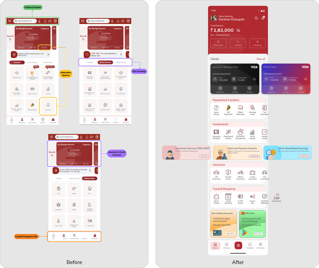

I updated the home screen with a modern look by switching from tab-based grouping to a scrollable category layout for a sleek, minimal design. Here’s how I addressed the key issues:
Cluttered Header: I noticed the header was too busy, so I removed extra icons and simplified the search bar to make it more user-friendly and reduce accidental taps.
Confusing Carousel: The accounts and cards were mixed up visually, so I redesigned them with distinct views to make it easy to check balances and bills without confusion.
Overloaded Bottom Navigation Bar: The navigation bar was cluttered with non-core features; I added core functionality and removed extras for a more streamlined interface.
Inconsistent Iconography: Icons across the app were mismatched, so I standardized them to ensure a cohesive and modern look throughout.
Redundant Options: I eliminated duplicate "Services" options and reorganized features to reduce complexity and make navigation more intuitive.
Menu Streamlining
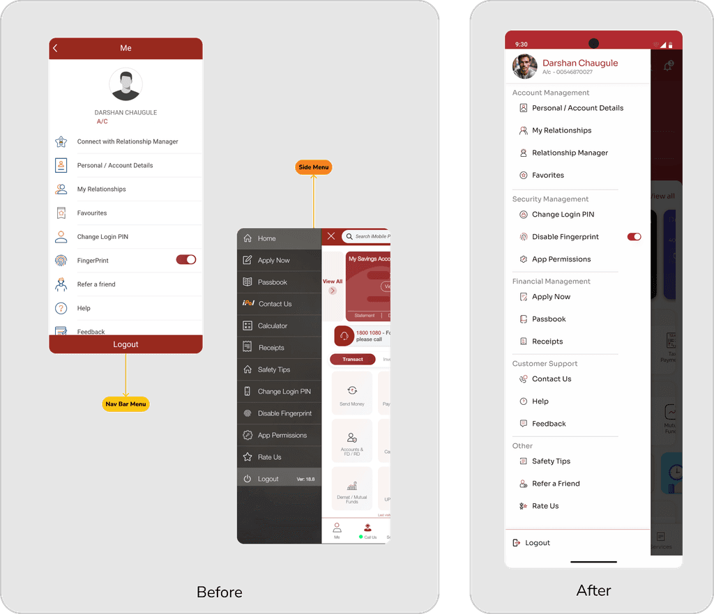
The app had two menus with overlapping functions, causing redundancy and confusion. I streamlined the menus by removing duplicates, grouping similar functions, and eliminating one menu to simplify navigation and enhance usability.
The app had two menus with overlapping functions, causing redundancy and confusion. I streamlined the menus by removing duplicates, grouping similar functions, and eliminating one menu to simplify navigation and enhance usability.

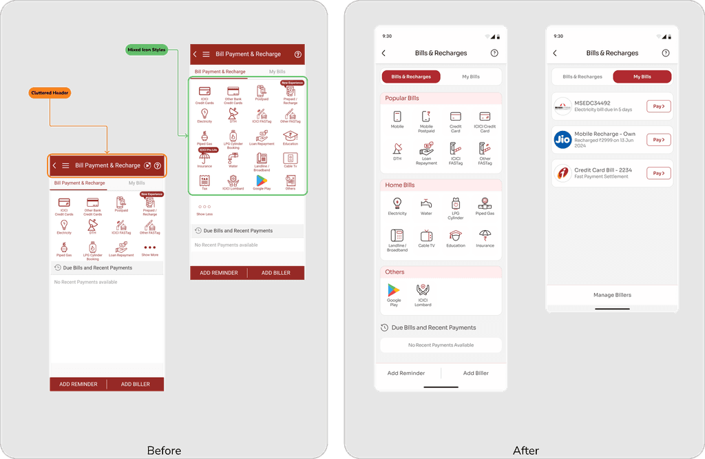
Revamping Bill Payments
Cluttered Header: The header was overcrowded with too many closely placed icons, making the back button hard to tap.
Design Inconsistencies: Mixed icon styles and excessive brand colors created a cluttered look.
I simplified the header, introduced custom icons, and adjusted color usage for a cleaner, more attractive design.

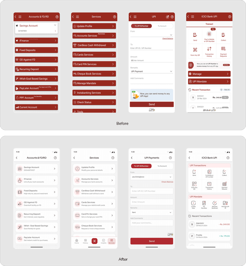
Settings & UPI Redesign
Excessive primary colors on settings screen and vague titles create a cluttered and confusing experience. I reduced the excessive use of primary colors to create a more visually appealing design and added concise descriptions to titles to improve feature understanding.
Excessive primary colors on settings screen and vague titles create a cluttered and confusing experience. I reduced the excessive use of primary colors to create a more visually appealing design and added concise descriptions to titles to improve feature understanding.

That's a wrap! I hope you enjoyed the case study. Thanks for reading! I’d really appreciate your feedback.
Resume
Darshan Chaugule
